Air Pollution
This is a data analysis report about air pollution in Belgrade with an explanation of the R code used. Data that will be used for the analysis comes from the stations, which are set up by an independent initiative Vazduh Gradjanima.
Reading and organising data
We will start the analysis by uploading the necessary packages and data into R.
If you have not got the packages used in the following code, you will need to uncomment the first few lines (delete the # symbol) in the code below.
> #install.packages("rmarkdown")
> #install.packages("leaflet")
> #install.packages("lubridate")
> #install.packages("dplyr")
> #install.packages("tidyverse")
> #install.packages("DT")
> library(leaflet)
> suppressPackageStartupMessages(library(lubridate))
> suppressPackageStartupMessages(library(dplyr))
> suppressPackageStartupMessages(library(tidyverse))
> # read data
> mydata <- read.csv('https://vazduhgradjanima.rs/files/data.csv',
+                     header=T,
+                     na.strings=c("","NA"),
+                     stringsAsFactor = FALSE)
It is always a good idea to have a look at data you upload, before you start using it for your analysis.
> # scan data
> glimpse(mydata)
## Rows: 29,426
## Columns: 11
## $ timestamp <chr> "2019-10-13T14:00:00Z", "2019-10-13T15:00:00Z", "2019-10…
## $ device_id <chr> "qr0Kde0VpQOQLCQNrFyIZWfy", "qr0Kde0VpQOQLCQNrFyIZWfy", …
## $ device_title <chr> "Klimerko Krunska", "Klimerko Krunska", "Klimerko Krunsk…
## $ location <chr> "44.80868072883205,20.465567163036557", "44.808680728832…
## $ pm10 <dbl> 20.5, 13.5, 22.0, 25.5, 34.0, 33.5, 31.5, 50.0, 51.5, 43…
## $ humidity <dbl> 30.62500, 33.50000, 37.45000, 41.15000, 44.07500, 44.875…
## $ pm1 <dbl> 13.0, 11.0, 15.5, 20.5, 22.0, 23.0, 22.0, 31.0, 32.0, 27…
## $ pm2.5 <dbl> 17.0, 11.5, 19.0, 25.5, 31.0, 32.0, 30.0, 41.0, 44.0, 38…
## $ pressure <dbl> 1006.000, 1006.000, 1006.000, 1006.750, 1007.000, 1007.0…
## $ temperature <dbl> 29.100, 28.025, 26.325, 25.000, 23.950, 23.475, 22.750, …
## $ uv.index <dbl> NA, NA, NA, NA, NA, NA, NA, NA, NA, NA, NA, NA, NA, NA, …We can do some tweaking, by removing a few variables and separating day from time and creating separate columns for latitude and longitude variables.
> ## remove 2nd and the last column
> mydata <- mydata[, -c(2, 11)]
> # separate date from time
> mydata <- separate(mydata, timestamp, c("date", "time"), sep = "T")
> ## remove the last character from the `time` variable
> mydata$time <- (str_sub(mydata$time, end = -2))
> ## separate lat and long
> mydata <- separate(mydata, location , c("lat", "lng"), sep =",")
> # scan data
> glimpse(mydata)
## Rows: 29,426
## Columns: 11
## $ date <chr> "2019-10-13", "2019-10-13", "2019-10-13", "2019-10-13", …
## $ time <chr> "14:00:00", "15:00:00", "16:00:00", "17:00:00", "18:00:0…
## $ device_title <chr> "Klimerko Krunska", "Klimerko Krunska", "Klimerko Krunsk…
## $ lat <chr> "44.80868072883205", "44.80868072883205", "44.8086807288…
## $ lng <chr> "20.465567163036557", "20.465567163036557", "20.46556716…
## $ pm10 <dbl> 20.5, 13.5, 22.0, 25.5, 34.0, 33.5, 31.5, 50.0, 51.5, 43…
## $ humidity <dbl> 30.62500, 33.50000, 37.45000, 41.15000, 44.07500, 44.875…
## $ pm1 <dbl> 13.0, 11.0, 15.5, 20.5, 22.0, 23.0, 22.0, 31.0, 32.0, 27…
## $ pm2.5 <dbl> 17.0, 11.5, 19.0, 25.5, 31.0, 32.0, 30.0, 41.0, 44.0, 38…
## $ pressure <dbl> 1006.000, 1006.000, 1006.000, 1006.750, 1007.000, 1007.0…
## $ temperature <dbl> 29.100, 28.025, 26.325, 25.000, 23.950, 23.475, 22.750, …We will check how many unique records each variable in our data has.
> (uniq <- unlist(lapply(mydata, function(x) length(unique(x)))))## date time device_title lat lng pm10
## 93 24 26 26 26 3403
## humidity pm1 pm2.5 pressure temperature
## 7572 2853 3245 1949 5291To us it is most interesting to notice that we have uniq[[3]] = 26 stations in total. Next, we’ll check if all of the stations are active, by examining the number of readings for each station.
> # how many reading each station makes
> mydata %>%
+   group_by(device_title) %>%
+   summarise(no_readings = n()) %>%
+   arrange(no_readings) %>%
+   DT::datatable()
There are a couple of stations with only one or two readings. We will remove those stations form the data set and focus in our study only on the active stations.
> # remove the inactive stations with only one or two readings using `filter()`
> mydata_new <- mydata %>%
+   filter(!device_title %in% c("Descon Klimerko Uciteljsko Naselje", "Descon Klimerko Rex"))
Mapping the stations
To see where the stations are allocated we will plot them on Google maps. We will use the leaflet package to do this and create a sub data with only a list of the stations and their positions.
> # creating a dataframe with only names and lat & lng for each station
> stations <- data.frame(lapply(mydata_new[,c(3:5)], function(x) unique(x))) %>%
+             drop_na()
> # convert factor data type into numeric
> stations [, 2] <- as.numeric(as.character(stations[,2]))
> stations [, 3] <- as.numeric(as.character(stations[,3]))
> summary(stations)
## device_title lat lng
## Length:23 Min. :44.27 Min. :19.88
## Class :character 1st Qu.:44.77 1st Qu.:20.42
## Mode :character Median :44.79 Median :20.46
## Mean :44.75 Mean :20.46
## 3rd Qu.:44.80 3rd Qu.:20.48
## Max. :44.84 Max. :20.92Once we have the subset data we can plot it using the leaflet package as below.
> library(leaflet)
>
> minlat <- min(stations$lat)
> maxlat <- max(stations$lat)
> minlng <- min(stations$lng)
> maxlng <- max(stations$lng)
>
> stations %>%
+   group_by(device_title, lat, lng) %>%
+   leaflet() %>%
+   addTiles() %>%
+   fitBounds(~minlng, ~minlat, ~maxlng, ~maxlat) %>%
+   addCircles(lng = ~lng, lat = ~lat,
+              radius = 150, weight = 5, color = "black",
+              fillColor = "red", fillOpacity = 0.7,
+              popup = ~paste("<b>", device_title)
+ ) > mydata_bg <- mydata %>%
+ filter(!device_title %in% c("Milovanovića Klimerko", "Descon Klimerko", "Descon Klimerko Smederevo")) Once removed, we will create a new map, by again creating sub dataframe with only stations we want to use in the analysis.
> # creating a dataframe with only names and lat & lng for each station
> stations <- data.frame(lapply(mydata_bg[,c(3:5)], function(x) unique(x))) %>%
+   drop_na()
> # convert factor data type into numeric
> stations [, 2] <- as.numeric(as.character(stations[,2]))
> stations [, 3] <- as.numeric(as.character(stations[,3]))
> summary(stations)
## device_title lat lng
## Length:22 Min. :44.75 Min. :20.40
## Class :character 1st Qu.:44.78 1st Qu.:20.42
## Mode :character Median :44.80 Median :20.46
## Mean :44.79 Mean :20.46
## 3rd Qu.:44.81 3rd Qu.:20.48
## Max. :44.84 Max. :20.52> # mapping the stations
> minlat <- min(stations$lat)
> maxlat <- max(stations$lat)
> minlng <- min(stations$lng)
> maxlng <- max(stations$lng)
>
> stations %>%
+ group_by(device_title, lat, lng) %>%
+ leaflet() %>%
+ addTiles() %>%
+ fitBounds(~minlng, ~minlat, ~maxlng, ~maxlat) %>%
+ addCircles(lng = ~lng, lat = ~lat,
+ radius = 150, weight = 5, color = "black",
+ fillColor = "red", fillOpacity = 0.7,
+ popup = ~paste("<b>", device_title)) Analysing the readings
In this section we will look through the readings and try to make some sense of it all. If you are not familiar with the information collected by the stations, ie. about the pm particles you can check the following link: https://www.irceline.be/en/documentation/faq/what-is-pm10-and-pm2.5.
Number of readings per week days
The next chunk of code counts the number of readings per each week day, it shows it in a table and visualises it using the ggplot2() package.
> mydata_bg %>%
+   mutate(wday = wday(date, label = TRUE)) %>%
+   group_by(wday) %>%
+   summarise(no_readings = n()) %>%
+   DT::datatable()
> mydata_bg %>%
+ mutate(wday = wday(date, label = TRUE)) %>%
+ ggplot(aes(x = wday, fill = wday)) +
+ geom_bar(color = "black") +
+ xlab("week days readings") +
+ scale_fill_brewer(palette = "Dark2") +
+ theme(legend.position = "none") 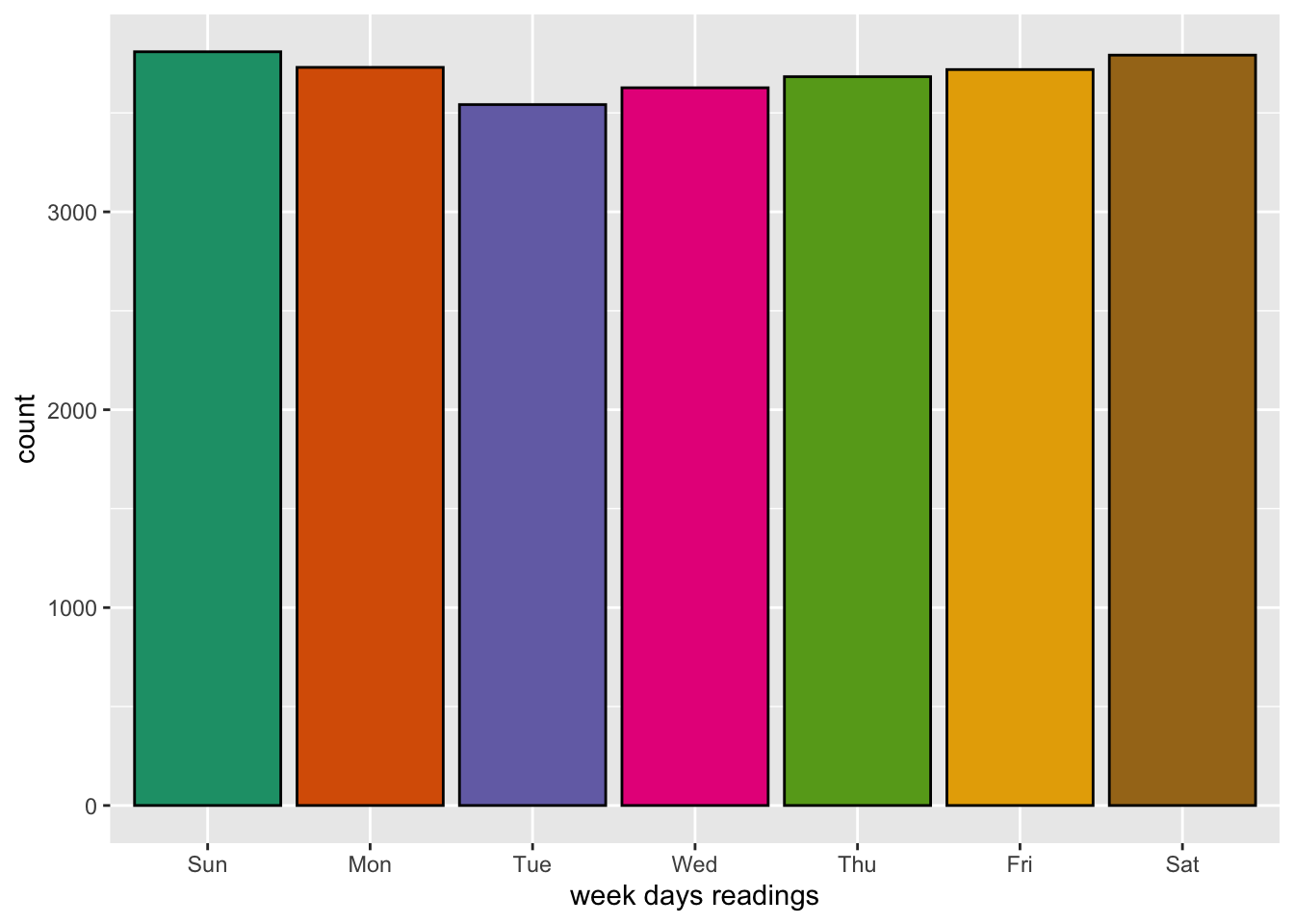
Average concentration of particles each week day
> # mean pm2.5 per week day
> mydata_bg %>%
+   mutate(wday = wday(date, label = TRUE)) %>%
+   group_by(wday) %>%
+   summarise(mean_pm2.5 = mean(pm2.5, na.rm = TRUE)) %>%
+   ggplot(aes(x = wday, y = mean_pm2.5, fill = wday)) +
+   geom_bar(stat="identity", color = "black") +
+   theme(plot.title = element_text(size = 14, vjust = 2, hjust=0.5)) +
+   labs (title = "average value of pm2.5 per week days",
+         caption = "Data from: https://vazduhgradjanima.rs",
+         x = "week days", y = "average pm2.5") +
+   scale_fill_brewer(palette="Accent") +
+   theme(legend.position="none")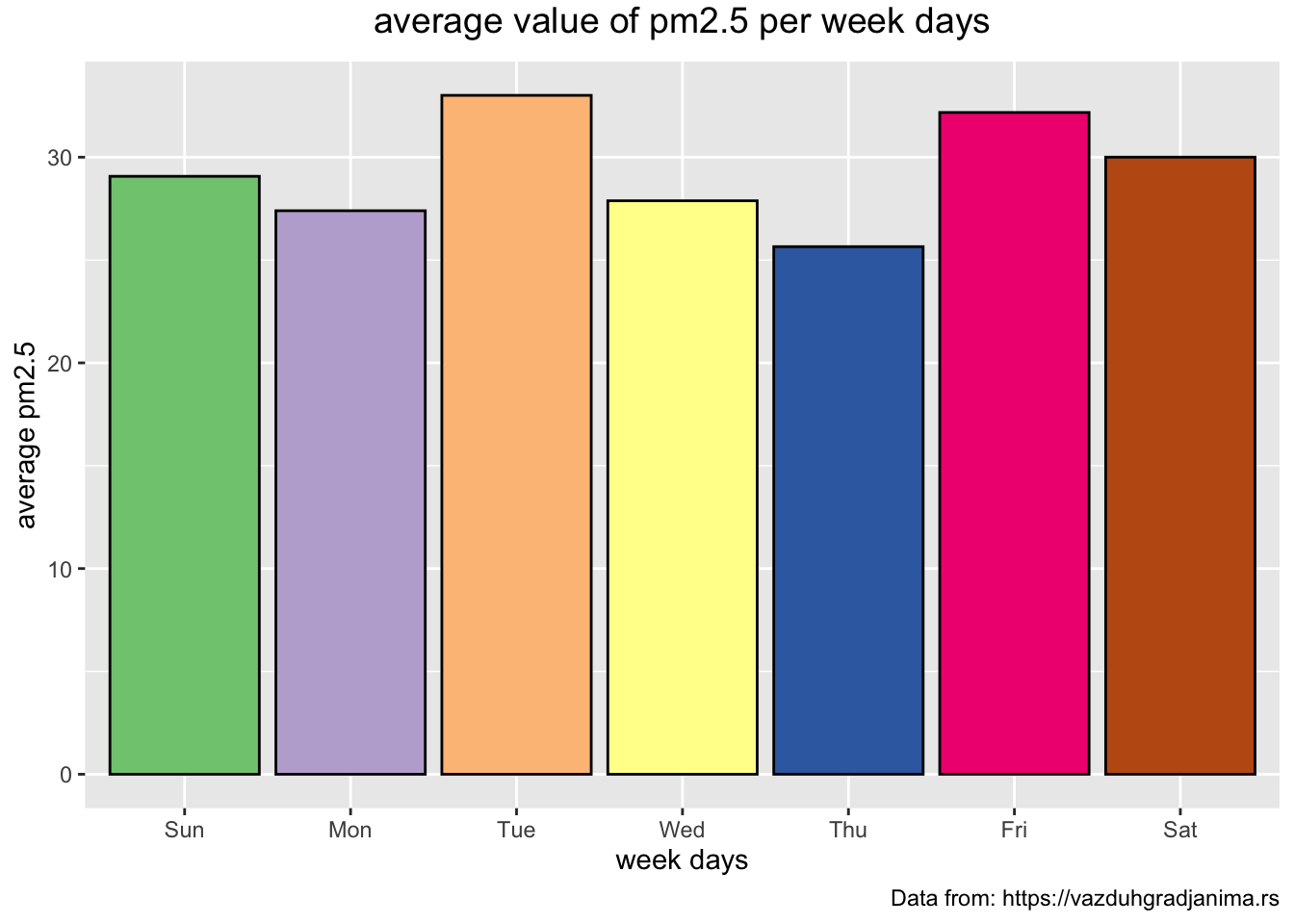
> # mean pm10 per week day
> mydata_bg %>%
+ mutate(wday = wday(date, label = TRUE)) %>%
+ group_by(wday) %>%
+ summarise(mean_pm10 = mean(pm10, na.rm = TRUE)) %>%
+ ggplot(aes(x = wday, y = mean_pm10, fill = wday)) +
+ geom_bar(stat="identity", color = "black") +
+ theme(plot.title = element_text(size = 14, vjust = 2, hjust=0.5)) +
+ labs (title = "average value of pm10 per week days",
+ caption = "Data from: https://vazduhgradjanima.rs",
+ x = "week days", y = "average pm10") +
+ scale_fill_brewer(palette="Accent") +
+ theme(legend.position="none") 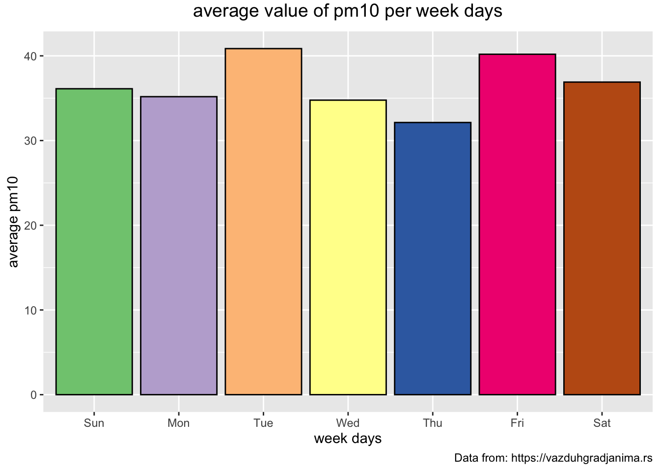 The previous two plots look very similar. It would be interesting to see the bars of the two plots next to each other.
> mydata_new %>%
+   mutate(wday = wday(date, label = TRUE)) %>%
+   group_by(wday) %>%
+   summarise(mean_pm2.5 = mean(pm2.5, na.rm = TRUE), mean_pm10 = mean(pm10, na.rm = TRUE)) %>%
+   gather("pm_no", "mean_pm", -wday, factor_key = TRUE) %>%
+   ggplot(aes(x = wday, y = mean_pm, fill = pm_no )) +
+   geom_bar(stat="identity", position = "dodge", color = "black") +
+   theme(plot.title = element_text(size = 14, vjust = 2, hjust=0.5)) +
+   labs (title = "average value of pm2.5 and pm10 per week days",
+         caption = "Data from: https://vazduhgradjanima.rs",
+         x = "week days", y = "average pm") +
+   scale_fill_brewer(palette="Set1") +
+ theme(legend.position="bottom") 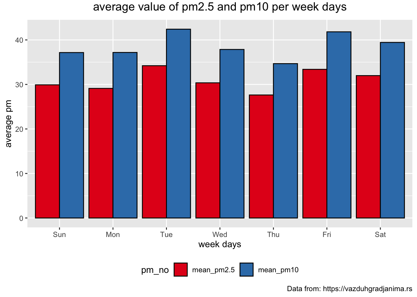
Average concentration of particles each month
> mydata_bg %>%
+   mutate(mon = month(date, label = TRUE, abbr = TRUE)) %>%
+   group_by(mon) %>%
+   summarise(no_readings = n()) %>%
+ DT::datatable()> # order monts Oct-Jan
> mydata_bg %>%
+ mutate(mon = month(date, label = TRUE, abbr = TRUE)) %>%
+ mutate(mon = factor(mon, levels=c("Oct", "Nov", "Dec", "Jan"))) %>%
+ group_by(mon) %>%
+ summarise(no_readings = n()) %>%
+ DT::datatable()> mydata_bg %>%
+ mutate(mon = month(date, label = TRUE, abbr = TRUE)) %>%
+ mutate(mon = factor(mon, levels=c("Oct", "Nov", "Dec", "Jan"))) %>%
+ group_by(mon) %>%
+ summarise(mean_pm2.5 = mean(pm2.5, na.rm = TRUE), mean_pm10 = mean(pm10, na.rm = TRUE)) %>%
+ gather("pm_no", "mean_pm", -mon, factor_key = TRUE) %>%
+ ggplot(aes(x = mon, y = mean_pm, fill = pm_no )) +
+ geom_bar(stat="identity", position = "dodge", color = "black") +
+ coord_flip() +
+ theme(plot.title = element_text(size = 14, vjust = 2, hjust=0.5)) +
+ labs (title = "average value of pm2.5 and pm10 per month",
+ caption = "Data from: https://vazduhgradjanima.rs",
+ x = "month", y = "average pm") +
+ scale_fill_brewer(palette="Paired") +
+ theme(legend.position="bottom") 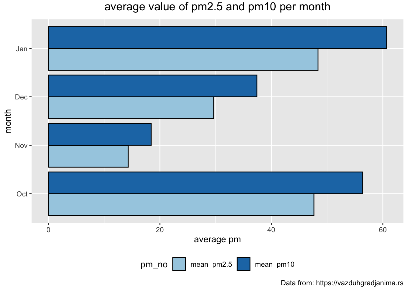
Average concentration of particles each hour
> mydata_bg %>%
+   group_by(time) %>%
+   summarise(no_readings = n()) %>%
+   DT::datatable()
> mydata_bg %>%
+ group_by(time) %>%
+ summarise(mean_pm2.5 = mean(pm2.5, na.rm = TRUE), mean_pm10 = mean(pm10, na.rm = TRUE)) %>%
+ gather("pm_no", "mean_pm", -time, factor_key = TRUE) %>%
+ ggplot(aes(x = time, y = mean_pm, fill = pm_no )) +
+ geom_bar(stat="identity", position = "dodge", color = "black") +
+ coord_flip() +
+ theme(plot.title = element_text(size = 14, vjust = 2, hjust=0.5)) +
+ labs (title = "average value of pm2.5 and pm10 per hour",
+ caption = "Data from: https://vazduhgradjanima.rs",
+ x = "month", y = "average pm") +
+ scale_fill_brewer(palette="Paired") +
+ theme(legend.position="bottom") 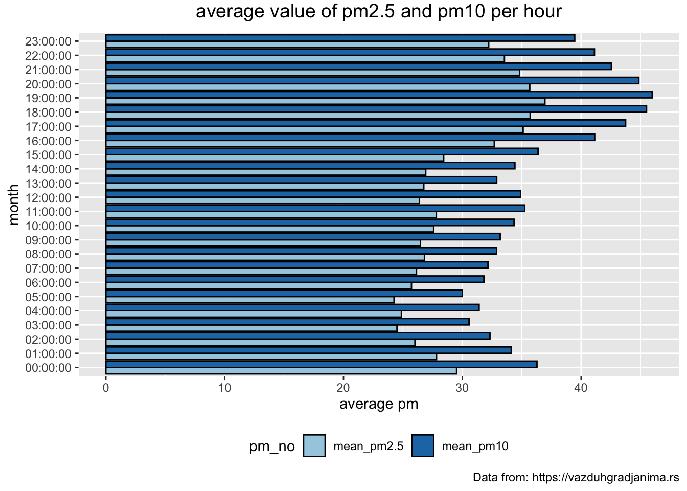
Pressure and Humidity vs pm10
In this section we will try to investigate if the concentration of pm particles depens upon other factors such as pressure and humidity.
pm10 vs pressure
To investigate the relationship between air pressure and concentration of pm10 particles we will create a scatterplot:
> mydata_bg %>%
+   drop_na() %>%
+   ggplot(aes(x = pressure, y = pm10)) +
+   geom_point(alpha = 0.2, shape = 20, col = "steelblue", size = 2) +
+   geom_smooth(method = "lm", se = F, col = "maroon3") +
+   geom_smooth(method = "loess", se = F, col = "limegreen") +
+   xlim(c(960, 1030)) +
+   ylim(c(0, 500)) +
+   # give a title an label axes
+   labs(title = "Pressure vs. pm10",
+        x = "pressure", y = "pm10.") +
+
+   # modify the appearance
+   theme(legend.position = "none",
+         panel.border = element_rect(fill = NA,
+                                     colour = "black",
+                                     size = .75),
+ plot.title=element_text(hjust=0.5)) 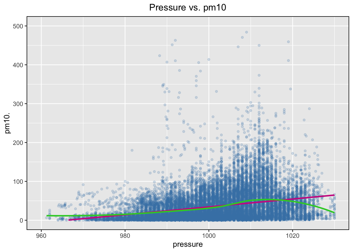
The data is quite messy, with a number of very extreme readings, which is why we “chopped” the axis using the xlim() and the ylim() functions after checking the distributions of the two variables. This is a part of informal investigation of the possible relationship between pm10 and pressure, and a more rigorous procedure should be adopted which is beyond the scope of module2’s lesson.
pm10 vs humidity
We will adopt the same approach to investigate a possible relationship between humidity and concentration of the pm10 particles.
> mydata_bg %>%
+   drop_na() %>%
+   ggplot(aes(x = humidity, y = pm10)) +
+   geom_point(alpha = 0.2, shape = 20, col = "steelblue", size = 2) +
+   geom_smooth(method = "lm", se = F, col = "maroon3") +
+   geom_smooth(method = "loess", se = F, col = "limegreen") +
+   # give a title an label axes
+   labs(title = "Humidity vs. pm10",
+        x = "humidity", y = "pm10.") +
+
+   # modify the appearance
+   theme(legend.position = "none",
+         panel.border = element_rect(fill = NA,
+                                     colour = "black",
+                                     size = .75),
+         plot.title=element_text(hjust=0.5))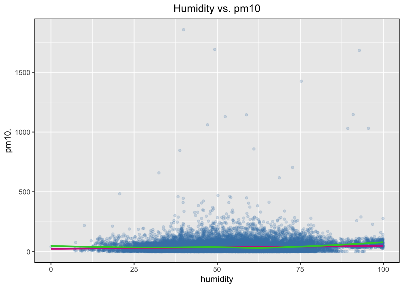
As a challenge try to use a scatterplot to investigate a possible relationship between the concentration of the p10 particles and the temperature.
Happy R coding!!! 😃🙌💜
YOUR TURN 👇
Using ‘athlete_events.csv’ file available from https://github.com/TanjaKec/RMarkdown4RR
(inside the data folder) create a RMarkdown report which will:
- Examine the structure of the data
- Select variables that end with letter
tand start with letterS - Create Body Mass Index variable as \(kg/m^2\) (hint: \(BMI = Weight / (Height/100)^2\))
- Filter from data:
- only Serbian teams and save it as
olympicSR - only Serbian teams from 2000 onward and save it as
olympicSR21cathletes whose weight is bigger than 100kg and height is over 2m (hint: Don’t forget to use == instead of =! and Don’t forget the quotes "")
- Arrange Serbian athletes in
olympicSR21cdata frame by Height in ascending and descending order.
- Using olympicSR df
- find the youngest athlete
- find the heaviest athlete
- Use
summarise():
- to print out a summary of olypicSR df containing two variables: max_Age and max_BMI
- to print out a summary of olypicSR df containing two variables: mean_Age and mean_BMI
- Remember:
- dplyr’s the
group_by()function enables you to group your data. It allows you to create a separate df that splits the original df by a variable - Function
datatable()from DT package enables you to display as table on HTML page an R data object that can be filtered, arranged etc
Knowing about the group_by() and DT::datatable() functions, find out number of medals for each of the exYU countrie team for 2016 olypic games?
- visualise your finding!
© 2020 Tatjana Kecojevic